
Quick Answer
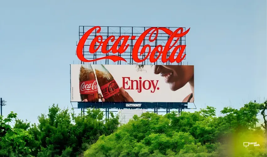
Coca-Cola is using one of its greatest advertising advantages in large-format OOH: instant recognition. The campaign relies on familiar bottle imagery, the script logo, red-and-white brand codes and short phrases such as “Always,” “Enjoy” and “Nothing like Coca-Cola,” allowing the brand to communicate at a glance without filling the billboard with unnecessary information.
Local OOH: Iconic Brand Assets Can Carry the Message in Large-Format OOH
Some brands need a long explanation to establish recognition. Others can rely on visual assets that audiences already understand in seconds.
Coca-Cola’s latest outdoor work leans into that advantage by using familiar brand codes and short phrases instead of filling the billboard with excessive information.
For brands looking to build a similarly focused presence in public space, Local OOH can help plan large-format OOH, roadside billboards and high-impact outdoor campaigns around the creative assets audiences already recognize.
Coca-Cola Brings a Refreshed Brand Identity Into OOH
According to the supplied campaign information, Coca-Cola brought a refreshed version of its identity system to the street through outdoor advertising developed by teams at VML Global and Majority Agency.
The creative idea is deliberately simple: use the elements people already associate with Coca-Cola and pair them with short lines such as “Enjoy,” “Always” and “Always refreshing.”
Instead of asking audiences to process multiple messages, the campaign lets the brand itself do most of the work.
Roadside OOH Uses “Always” as a Minimal Brand Statement
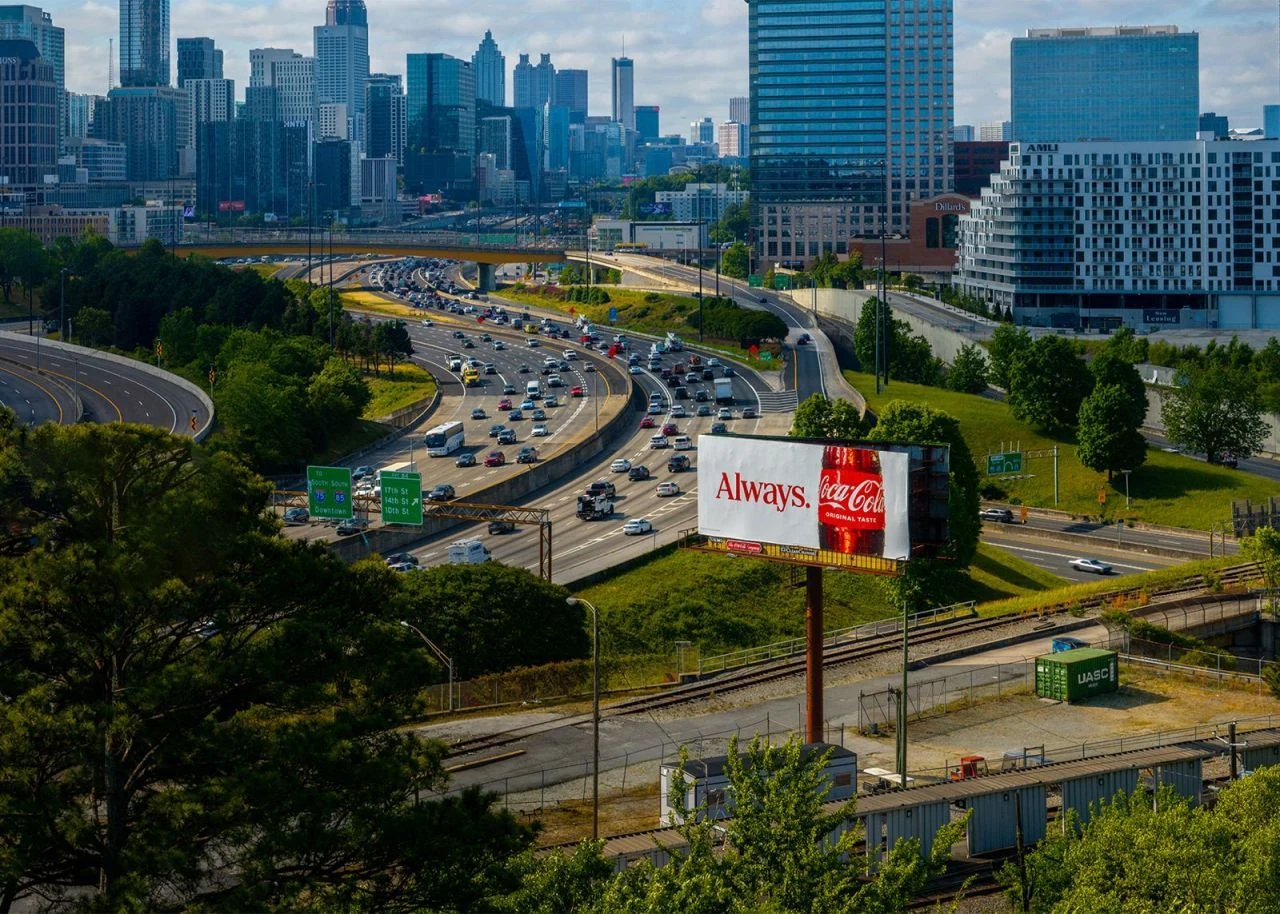
One execution reduces the message to a single word: “Always.”
The billboard places that line beside a close-up of a Coca-Cola bottle, creating a layout that is easy to recognize even from a distance or at driving speed.
The simplicity is especially effective in roadside media because the audience has only a short amount of time to process the creative. The phrase is brief, the product is familiar and the visual hierarchy is immediate.
Urban Billboards Use “Enjoy” to Keep the Message Instantly Recognizable
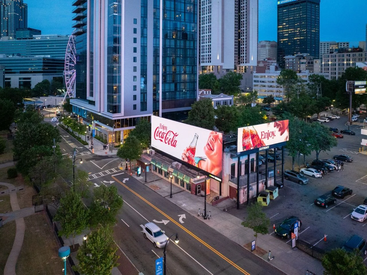
Another execution centers the familiar “Enjoy Coca-Cola” line across large urban billboard placements.
The creative combines the script logo, product photography and lifestyle imagery while leaving enough negative space for the message to remain easy to understand from a distance.
By keeping the layout simple, the campaign allows Coca-Cola’s visual identity to remain the primary communication device rather than relying on additional explanatory copy.
“Nothing Like Coca-Cola” Lets Familiar Brand Codes Do the Work
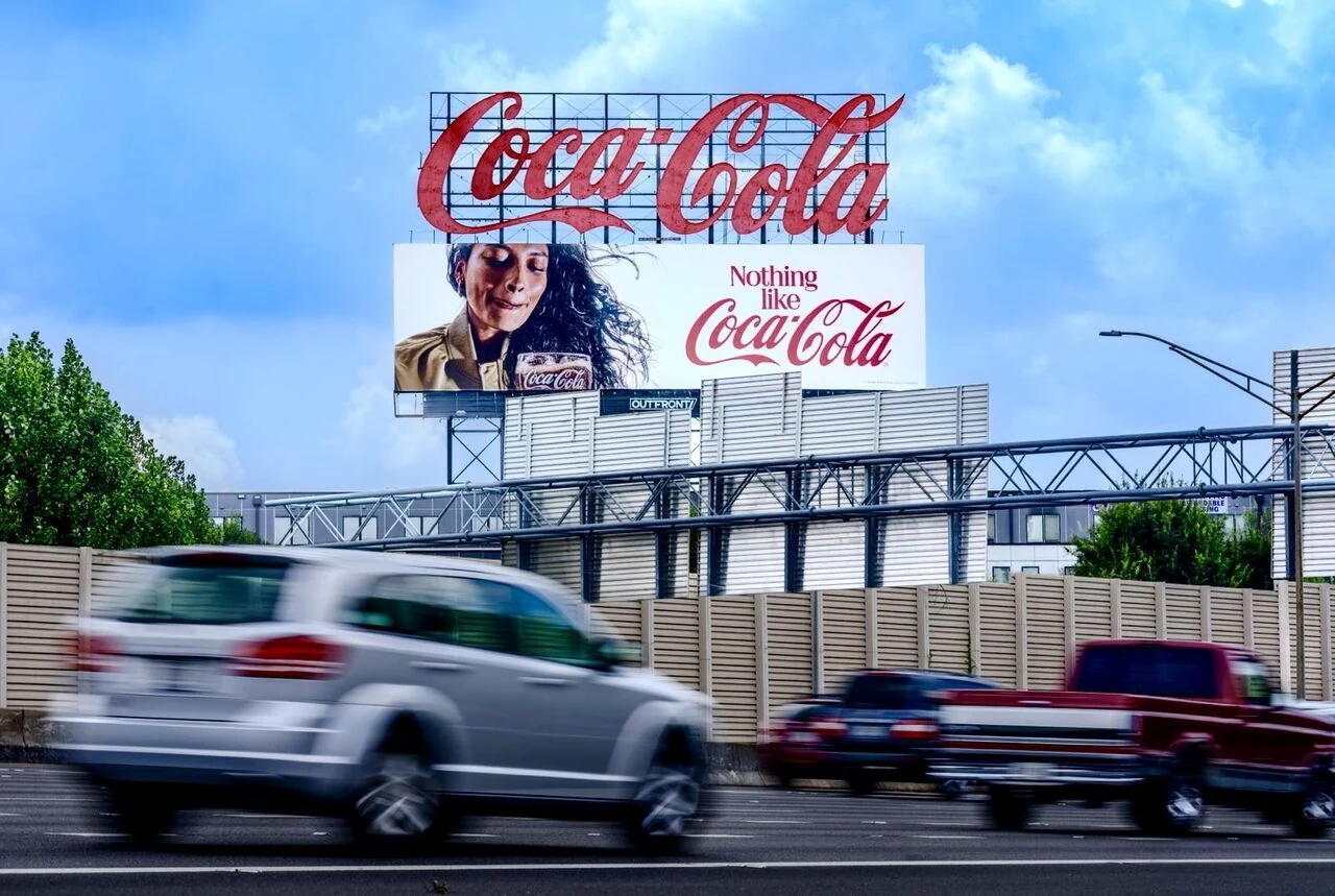
The “Nothing like Coca-Cola” execution continues the same strategy with a short statement, prominent script branding and a product-focused lifestyle image.
Placed above a roadway, the billboard has to communicate quickly. The campaign answers that challenge by relying on visual assets that already carry strong recognition.
The oversized Coca-Cola sign above the billboard further amplifies the effect, creating a layered brand presence that remains unmistakable even from a distance.
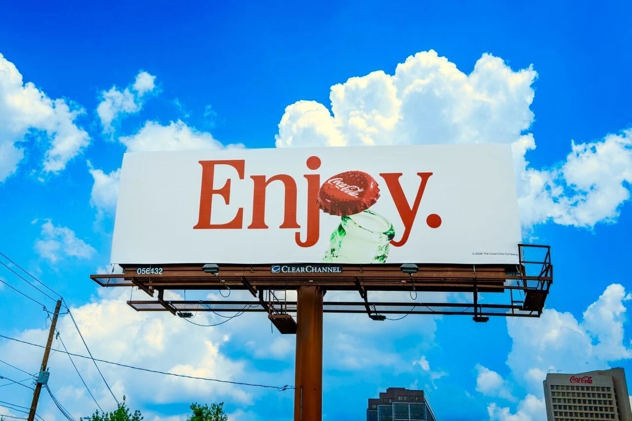
The “Enjoy” Bottle-Cap Billboard Reduces the Idea to Its Essentials
A further execution strips the creative down even more, using only the word “Enjoy.” alongside a bottle and Coca-Cola cap.
The concept works because the brand does not need to explain what the product is. The bottle shape, cap and typography provide enough information for recognition.
This is a useful example of how established brand assets can create impact through subtraction rather than addition.
Minimal Copy Helps Large-Format OOH Work at Speed
Outdoor media often has only seconds to make an impression, particularly along highways and high-traffic roads.
Short lines such as “Always,” “Enjoy” and “Nothing like Coca-Cola” can be processed quickly while the bottle silhouette, logo and color system provide the rest of the brand information.
The campaign therefore creates impact by removing anything the audience does not need in order to recognize the advertiser and understand the tone of the message.
Why Coca-Cola’s Large-Format OOH System Stands Out
- Recognizable brand assets replace excessive explanation. The bottle, script logo and familiar language carry much of the communication.
- Short copy is suited to roadside viewing. The audience can process the message quickly while moving through the environment.
- Negative space strengthens the hierarchy. The layouts give the headline and product imagery room to dominate.
- The system remains flexible across different placements. Lifestyle imagery, product close-ups and minimal graphic executions all fit within the same identity.
- The brand remains unmistakable. Even when the copy changes, Coca-Cola’s visual codes maintain consistency across the campaign.
What Brands Can Learn From Coca-Cola’s OOH Identity Strategy
The campaign shows that outdoor advertising does not always become stronger by adding more information.
When a brand already owns distinctive colors, shapes, typography, product silhouettes or familiar language, simplifying the creative can allow those assets to work harder.
For brands looking to build a similarly focused system, Local OOH can help identify large-format billboard, roadside and DOOH placements where simple creative can benefit from scale and repeated visibility .
Build Your Next Brand-Led OOH Campaign With Local OOH
If your brand wants to translate a recognizable visual identity into a focused outdoor campaign, Local OOH can help turn the idea into a coordinated real-world campaign through billboards, large-format OOH, DOOH and high-impact placements selected around audience movement and creative visibility.
Summary
The campaign shows how distinctive brand assets can do more of the communication work in outdoor advertising. Instead of dense copy, Coca-Cola uses highly recognizable visual cues and concise language across roadside and urban billboards. The result is a flexible OOH system that remains legible at speed, consistent across placements and unmistakably Coca-Cola.
Sources
Campaign information and visuals were supplied for this article. The supplied material identifies Coca-Cola, VML Global and Majority Agency and describes a refreshed OOH identity system built around familiar Coca-Cola visual codes and short lines including “Enjoy,” “Always” and “Always refreshing.” No verified reach, impression, media spend or campaign-performance figures were supplied.
FAQs
What is Coca-Cola doing in this OOH campaign?
The campaign brings a refreshed version of Coca-Cola’s identity system into large-format outdoor advertising through simple copy, bottle imagery and familiar brand codes.
Which agencies are connected to the campaign?
The supplied campaign information identifies teams at VML Global and Majority Agency.
Which phrases appear in the Coca-Cola OOH creative?
The supplied material highlights short lines including “Enjoy,” “Always” and “Always refreshing,” while the supplied visuals also show “Nothing like Coca-Cola.”
Why does the creative use so little copy?
The campaign relies on Coca-Cola’s familiar bottle shape, script logo and established visual identity so the billboards can remain simple while still being recognizable.
Why does this approach work well in roadside OOH?
Short copy and familiar visual cues can be processed quickly, which is useful in environments where drivers and passengers have limited viewing time.

Comments (0)
Join the conversation. Keep it respectful and on-topic.