
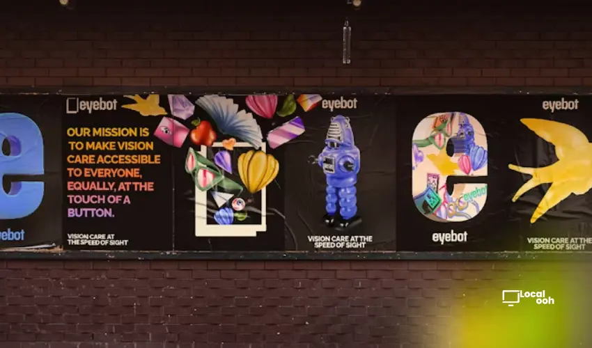
Quick answer: Graphic designer Mac Brown, one of Creative Review’s Gradwatch 2026 picks, is building a practice around bold colour, retro visual language and design for good, using projects like Supermarket Agenda, Woke Foods and EyeBot to make social commentary feel playful, accessible and memorable.
A New Voice in Graphic Design
Mac Brown is part of Creative Review’s annual Gradwatch showcase, which highlights emerging talent across the creative industries.
A recent graduate from the Northern School of Art with a BA in graphic design, Brown’s work reflects a strong belief that design can be more than visual decoration.
For him, design is a way to make ideas visible, create emotion, educate audiences and inspire change in everyday life.
From Fine Art to Graphic Design
Brown was originally drawn to traditional art, but his time studying both fine art and graphic design changed the direction of his creative practice.
Graphic design offered a way to merge artistic expression with products, brands, communication and emotional impact.
That combination helped him see design as a practical creative tool that can influence how people understand messages, identities and social issues.
Designing With Purpose
A recurring theme in Brown’s work is design for good.
His projects often engage with social injustice, political commentary, inequality and LGBT+ visibility.
Rather than treating these themes in a purely serious or institutional way, Brown often uses humour, bold visuals and satire to make the work feel more approachable and engaging.
Supermarket Agenda and the Power of Satire
One of Brown’s ongoing projects, Supermarket Agenda, uses the language of consumer culture to challenge hateful or closed-minded attitudes.
The project has appeared through zines, posters and now a broader brand and packaging system called Woke Foods.
By placing social commentary inside a supermarket-inspired world, Brown turns familiar retail codes into tools for critique and conversation.
Woke Foods as Fictional Branding
Woke Foods imagines a fictional supermarket inside an alternate, exaggerated “woke” world.
The project includes satirical product concepts such as Queerios and a washing powder designed to wash the “hate out”.
Visually, the work draws from mid-century packaging and supermarket iconography, then amplifies the colour, typography and visual attitude to underline the satirical tone.
Retro Influence, Bold Icons and Colour
Brown’s visual style has developed around bold icons, retro references, colourful imagery and increasingly expressive palettes.
After previously working with more minimal colour systems, he now embraces fuller palettes, complementary tones, primary colours and gradients.
This gives his work a bright, layered and sometimes chaotic visual energy that fits naturally with packaging, surface design and public-facing graphic systems.
EyeBot and Human-Centred Technology Branding
Another major project in Brown’s portfolio is EyeBot, a university branding project based on a live brief.
The concept involved creating a brand for an eyecare machine intended to change how the US market interacts with eye health.
Brown’s challenge was to speak to both business decision-makers and everyday users, while making the technology feel bold, warm and community-driven.
Making Technology Feel Less Alien
For EyeBot, Brown avoided an overly technical visual approach.
Instead, he used warm colours, stylised illustrations and a playful logo inspired by the machine itself and the shape of glasses frames.
The result was a brand identity that made new technology feel more personal, accessible and inviting.
Building a Practice Across Real-World Projects
Beyond university, Brown has also worked across a range of real-world creative projects.
These include work for Join The Dots, a Yorkshire-based creative community group, supermarket set design for an ITV show, a North Yorkshire Moors campaign encouraging people to explore the countryside and branding for local businesses.
Those experiences have allowed him to apply his interest in packaging, surface design, identity and storytelling across different formats and audiences.
Why This Creative Profile Matters
Mac Brown’s work stands out because it combines visual confidence with a clear point of view.
His projects do not separate style from meaning. Instead, colour, humour, packaging language and identity systems become ways to make social ideas easier to enter and harder to ignore.
As he moves into his master’s degree and explores larger-scale work, exhibitions and surface design, Brown’s practice shows how emerging designers can use branding tools to build worlds that entertain, challenge and create conversation.
What Marketers and Designers Can Learn From Mac Brown
- Design becomes stronger when visual style is connected to a clear point of view.
- Satire can make serious social themes more accessible without removing their meaning.
- Packaging and retail language can be powerful tools for cultural commentary.
- Warmth and playfulness can help technology brands feel more human.
- Emerging creative talent can build distinctive work by combining purpose, craft and personal curiosity.




Comments (0)
Join the conversation. Keep it respectful and on-topic.