
Quick Answer
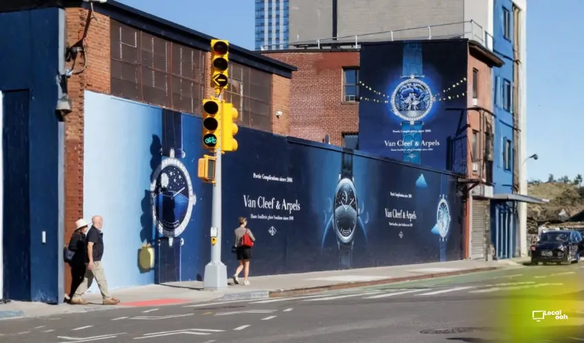
Van Cleef & Arpels brings its luxury watchmaking universe into public space through a large-scale blue wallscape campaign. The supplied visuals feature several of the Maison’s Poetic Complications watches alongside the lines “Poetic Complications since 2006” and “Haute Joaillerie, place Vendôme since 1906.” By extending the creative across multiple walls and façades, the campaign turns the surrounding streetscape into a premium visual environment built around craftsmanship, storytelling and product detail.
Van Cleef & Arpels Brings Its Poetic Watchmaking Universe Into Public Space
Van Cleef & Arpels transforms a large urban wall into a deep blue luxury canvas centered on its watchmaking and jewelry heritage.
The supplied campaign visuals feature oversized representations of several watches alongside the lines “Poetic Complications since 2006” and “Haute Joaillerie, place Vendôme since 1906.”
Rather than relying on conventional product photography alone, the campaign expands the brand world across an entire building façade, creating a highly visible Wallscape Advertising execution that feels closer to a piece of public art than a standard billboard.
For luxury, fashion and jewelry brands looking to create a similarly premium urban presence, Local OOH can help plan wallscapes, murals, billboards and high-impact luxury campaigns across major U.S. markets.
A Deep Blue Wallscape Creates a Unified Luxury Environment
The first supplied image shows the campaign extending across multiple connected wall surfaces.
Large watch visuals sit against a rich blue background while the Van Cleef & Arpels name remains central and highly legible.
The scale helps the detailed watches read clearly from the street while the continuous color treatment makes the entire block feel part of one coordinated brand environment.
The Hand-Painted Process Adds Craft to the Media Itself
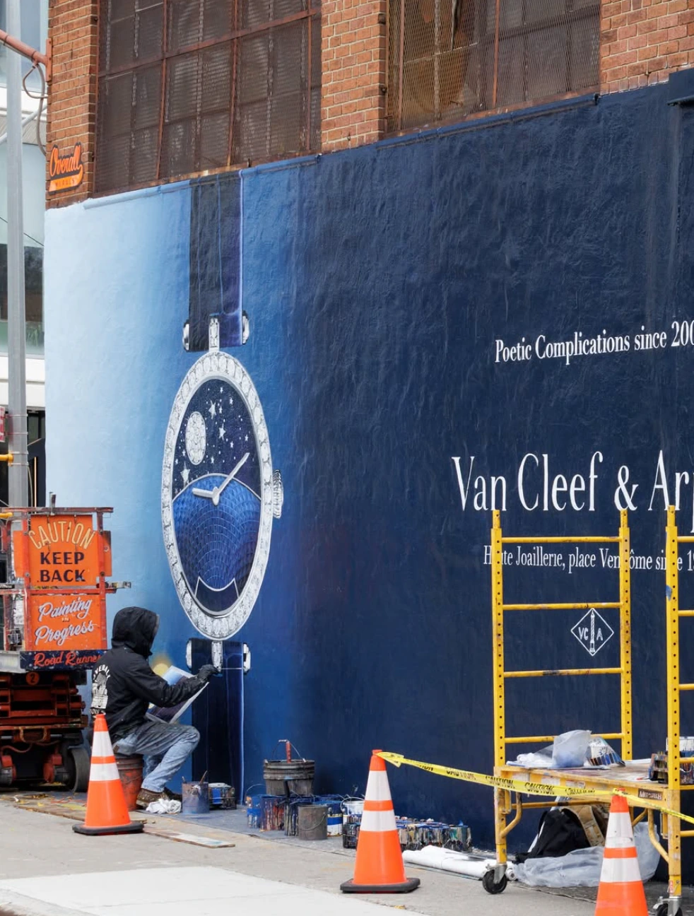
One of the most interesting supplied images shows the execution being painted directly onto the wall.
That process creates a meaningful connection between medium and message.
Van Cleef & Arpels is a brand associated with craftsmanship and intricate detail, and the use of a hand-painted wallscape gives the advertising format its own sense of physical artistry.
The campaign therefore communicates craft not only through the watches pictured in the creative, but through the construction of the media itself.
Poetic Complications Become Large-Scale Visual Storytelling
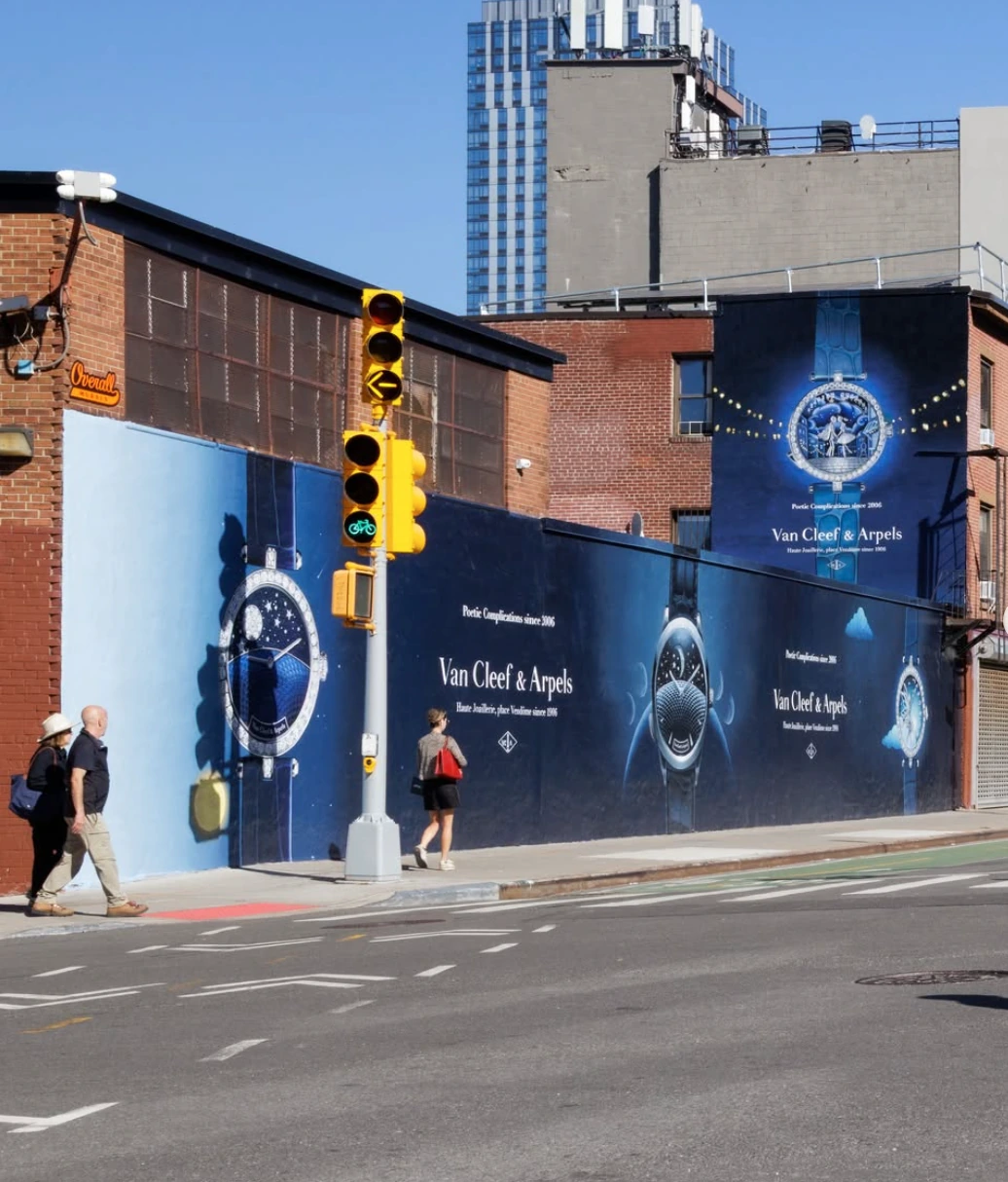
The third supplied visual shows two distinct watch designs appearing across the same deep blue streetscape.
One watch uses celestial imagery while another features a whimsical illustrated scene, reinforcing the idea that the collection is built around more than timekeeping alone.
The line “Poetic Complications since 2006” gives the campaign a clear conceptual frame without overwhelming the product.
Close-Up Product Detail Still Works at Monumental Scale
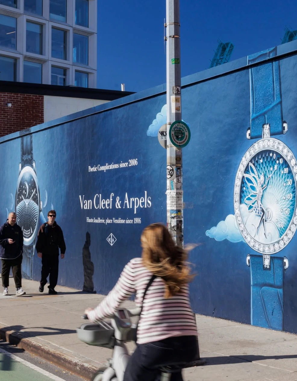
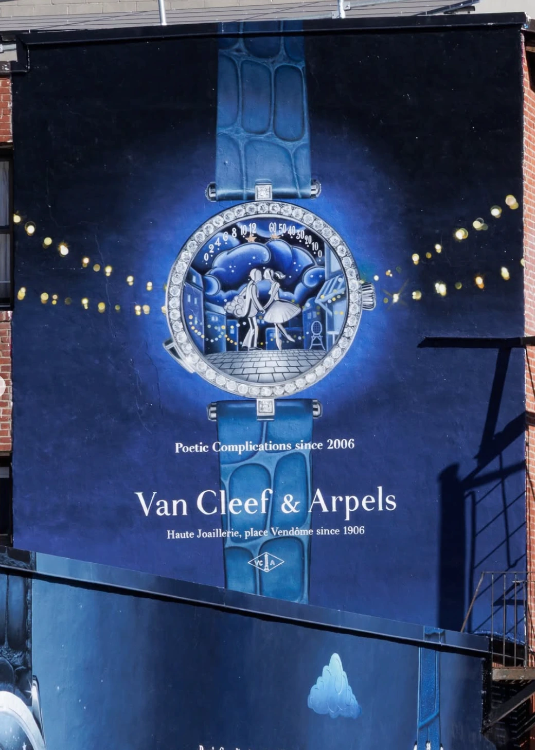
The fourth image focuses more closely on one of the watch executions.
The enlarged dial reveals the jewelry-like border, illustrated night scene and deep blue strap, allowing pedestrians to see details that would normally be experienced only at close range.
This is one of the strengths of large-format Outdoor Advertising: a small luxury object can be expanded until craftsmanship becomes the dominant visual experience.
The Full Streetscape Makes the Campaign Feel Like a Neighborhood Takeover
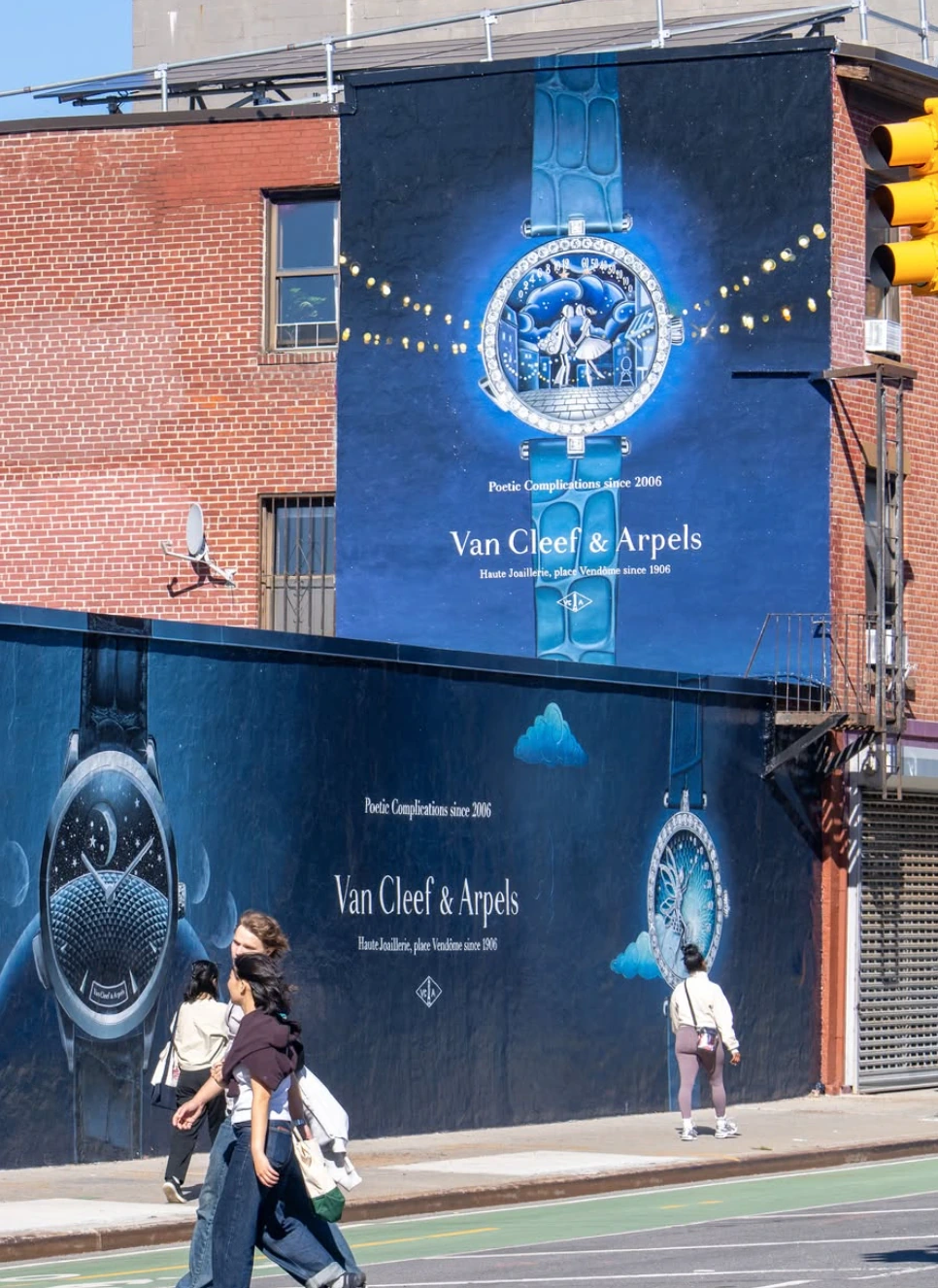
The final supplied image provides a wider view of the installation across several connected building surfaces.
Pedestrians, cyclists and street traffic move through the foreground while the blue campaign dominates the architecture behind them.
This larger context is important because it shows how the execution behaves in real life: not as a single isolated poster, but as a branded environment integrated into the movement of the city.
Why the Van Cleef & Arpels Wallscape Works
- The color system is consistent. Deep blue unifies multiple walls and watch designs.
- The products are monumental. Fine watchmaking details become visible at city scale.
- The format reinforces craftsmanship. The hand-painted execution mirrors the brand’s emphasis on artistry.
- The typography stays restrained. Product and atmosphere do most of the communication.
- The media becomes part of the architecture. The campaign reads as an environment rather than a standalone ad.
Local OOH: Luxury Brands Can Turn Architecture Into Brand Experience
Van Cleef & Arpels demonstrates how wallscape advertising can create a premium city presence without relying on excessive copy or aggressive promotional language.
The brand uses scale, color, product detail and craftsmanship to build a visual world that feels consistent with luxury positioning.
For jewelry, watches, fashion and premium lifestyle brands, this kind of Creative OOH can transform an ordinary façade into a destination-level brand moment.
Local OOH can help premium brands combine wallscapes, murals, billboards and neighborhood takeovers to build high-impact visibility in major U.S. markets.
Build Your Next Luxury Wallscape With Local OOH
Want to turn product craftsmanship into a city-scale visual experience? Local OOH can help plan and quote your next campaign.
From hand-painted murals to large-format wallscapes, the right format can make a luxury product impossible to overlook while preserving the detail and refinement that define the brand.
Summary
Van Cleef & Arpels uses large-format Outdoor Advertising to translate the detail of luxury watchmaking into a city-scale experience. The supplied campaign visuals show a deep blue painted environment featuring oversized watch faces, poetic illustrations, jewelry-style detailing and elegant typography. One image also reveals the mural being hand painted, emphasizing the physical craft behind the media itself. For Local OOH, the campaign is a strong example of how a luxury brand can use wallscape advertising to make a highly detailed product feel monumental without losing refinement.
Sources
This article is based on the supplied line “Shining bright like a diamond for @vancleefarpels” and five supplied campaign visuals. The images show Van Cleef & Arpels branding, the lines “Poetic Complications since 2006” and “Haute Joaillerie, place Vendôme since 1906,” multiple luxury watch designs, a large blue wallscape and one image of the mural being painted. No external campaign, media-spend, reach, impression or performance figures were supplied.
FAQs
Which brand is featured in the campaign?
The supplied visuals feature Van Cleef & Arpels.
What products are shown?
The campaign features several highly detailed Van Cleef & Arpels watches.
What campaign line appears in the visuals?
The supplied images include the line “Poetic Complications since 2006.”
What OOH format is visible?
The visuals show a large-format wallscape or mural treatment extending across multiple building surfaces.
Why is the hand-painted execution relevant?
The physical painting process reinforces the campaign’s connection to craftsmanship, artistry and luxury detail.

Comments (0)
Join the conversation. Keep it respectful and on-topic.