
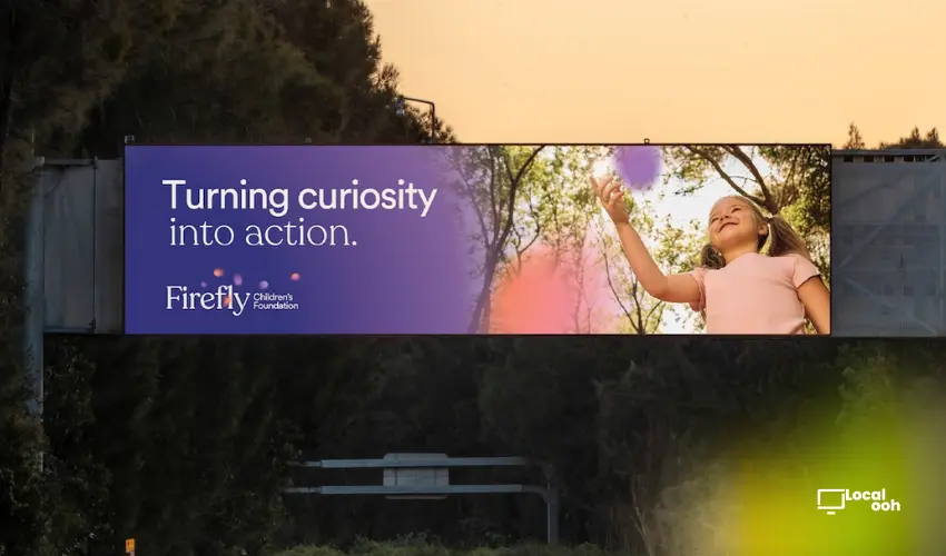
Quick answer: Channel 7 Children’s Research Foundation has officially rebranded as Firefly Children’s Foundation, introducing a new identity designed to better reflect its role in advancing children's medical research while bringing hope, clarity and connection to families and communities.
A New Name For A New Era
After five decades of supporting groundbreaking pediatric research, Channel 7 Children’s Research Foundation has entered a new chapter with the launch of its new name: Firefly Children’s Foundation.
The rebrand aims to better communicate the organization's impact, mission and future ambitions while maintaining the trust and credibility it has built throughout South Australia.
The new identity is intended to make the foundation's work more visible and accessible to supporters, families, researchers and the wider public.
Creating Clarity Around Complex Research
The project was developed by Adelaide-based branding and communications agency communikate et al.
According to the agency, the challenge was to create a brand that balanced the emotional importance of the foundation's work with the scientific rigor behind its research initiatives.
Extensive stakeholder research helped shape an identity that feels human, optimistic and approachable while remaining credible and grounded in evidence-based medical research.
Lighting The Way Forward
The creative strategy centered around a simple but powerful idea: "Lighting the way forward."
This narrative reflects the foundation's role in supporting breakthrough discoveries, funding innovative programs and helping improve outcomes for children and families.
The concept also reinforces the organization's mission to provide hope, guidance and meaningful progress through research and innovation.
By focusing on light as a symbol of discovery and possibility, the new brand creates a strong emotional connection while remaining aligned with the foundation's scientific purpose.
The Meaning Behind The Firefly
At the center of the rebrand is a distinctive firefly-inspired symbol.
The mark was designed to represent optimism, progress and human connection while serving as a visual beacon that cuts through complexity.
Much like a firefly illuminating darkness, the foundation seeks to bring clarity to complex medical challenges and support pathways toward better outcomes for children.
The symbol also reinforces the idea that even small sources of light can create meaningful change.

More Than A Visual Refresh
This rebrand goes beyond a new logo or visual system. It represents a strategic repositioning designed to strengthen awareness, engagement and understanding of the foundation's work.
By introducing a more contemporary and emotionally resonant identity, Firefly Children’s Foundation hopes to deepen connections with donors, families, researchers and future supporters.
The transformation creates a stronger platform for communicating impact while helping the organization continue its mission for the next generation.
Why This Rebrand Works
- Creates a clearer and more memorable identity.
- Balances emotional storytelling with scientific credibility.
- Uses a powerful visual symbol connected to the mission.
- Strengthens public understanding of the foundation's impact.
- Builds a platform for future growth and engagement.
With its new identity as Firefly Children’s Foundation, the organization enters a new era focused on visibility, connection and progress. The rebrand demonstrates how thoughtful brand strategy can help nonprofit organizations communicate complex work in a way that feels both meaningful and inspiring.


Comments (0)
Join the conversation. Keep it respectful and on-topic.